Lost and Found Edges
Share
Renoir's A Vase of Lilacs and Roses Poster
by MyHeartRenoir
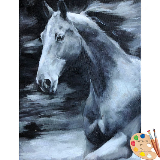
What makes one painting more successful than another? Reasons are many, but one of the often overlooked aspects is the treatment of edges. Here are two paintings by Renoir, each has a different feel to them thanks to the treatment of edges. Edges can create atmosphere and softness and emphasize form. They are also used as directional aids to lead the eye about the picture plane. Edges can also influence values and just as values have varying degrees so does edge treatment.
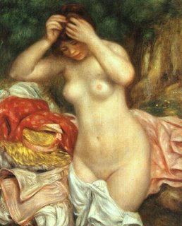
Edges can be lost, soft, firm and hard. When looking at an Old Master's painting note how varying degrees of edge treatments are used to emphasize different aspects within a painting to make the setting believable.
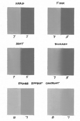
Courtesy of Tristan Elwell
Tristan summarized this rather nicely:
In general, edges are:
Harder in the light, softer in the shadow
Harder in bright light, softer in dim light
Harder in focused light, softer in diffused light
Harder in the foreground, softer in the background
Harder on smooth forms, softer on textured forms
Harder on hard forms, softer on soft forms (Duh, but really)
Harder on flat forms, softer on rounded forms
Harder on thin forms, softer on thick forms
Harder on still forms, softer on forms in motion (on moving forms they are harder on the leading edge and softer on the trailing edge)
Harder at the center of interest, softer as you move away
The above are additive. So a kitten, far away, in the dark, would be really soft.
Of course, any of these guidelines can be ignored/modified for pictorial effect.
In a Student's Guide to Painting by Jack Faragasso, which I believe to be the most valuable book ever to be published (a precursor to Marvin Mattelson's Bible!) this is summarized this way:
Making to mixtures of paint one light one dark (Tristan used a two-value spread for the images)place the two values side by side. When applying these principles the paint on the form and the background have to be wet or it won't work.
- Paper hard edge: Place the two values right next to each other without any overlapping.
There should be a good reason why you place a paper hard edge. The paint should be heavy and devoid of most of it's oils (cheaper brands are more oily so place paint on paper towel and let oil seep out before using). The brush stroke should be applied quickly, pressing down on the brush as it touches the canvas, and lifting it up as it nears completion.
- A firm edge : In the next box paint the two values next to each other. Now drag a flat Sable brush down the center just once . This will bring the two areas together creating a firm edge.
This type of edge is mainly used on the light of form to convey the feeling of roundness on a form.Brush the edge of the form into the background. However, since it is on the light side it must remain firm.
- A soft edge: In the third box repeat the process as before. Using a clean, dry, flat sable brush drag it down the dividing line, zig-zagging the brush as you go down the line. When you reaches the bottom clean of your brush, make sure it's dry and gently pull it over the zig zag, smoothing out the stroke. - A blurred edge is the same, just with a wider zigzag.
- A non-edge: In the fourth box repeat the steps of box three, only make your zig-zag very wide. Now, with a wide dry brush go over the zig-zag to make a very blurred edge. The two values have become to similar that there is hardly any definition between them. This can occur both in the shadow and light area, although it is more usual in the shadow area.
Make sure the correct values are placed side by side before blurring.
In the last two examples Tristan shows how edges effect contrast, especially within a narrow value range. The values used for the two are identical, the only difference is that the in the first the edge is kept as hard as possible, while in the second it is softened to the point of disappearing.
Some colors produce a bleeding effect and will not blend satisfactorily:
Alizarin Crimson, Prussian Blue, Thalo Green and Thalo Blue are especially prone to bleed. If you have to use these colors leave a 1/4 or 1/2 in gap between the two adjacent colors. Now use a paint that is compatible in value and color of the form and place it in the gap. Now drag the paint from each color half way towards the center. Finally with a clean wide brush make a downward stroke at the juncture of the two tones to fuse them. You can brush over several times until the area is well blended. This will avoid the bleeding effect.


