Wicked Strong Horse - Portraits by NC
Share
Wicked Strong Horse - Portraits by NC.com
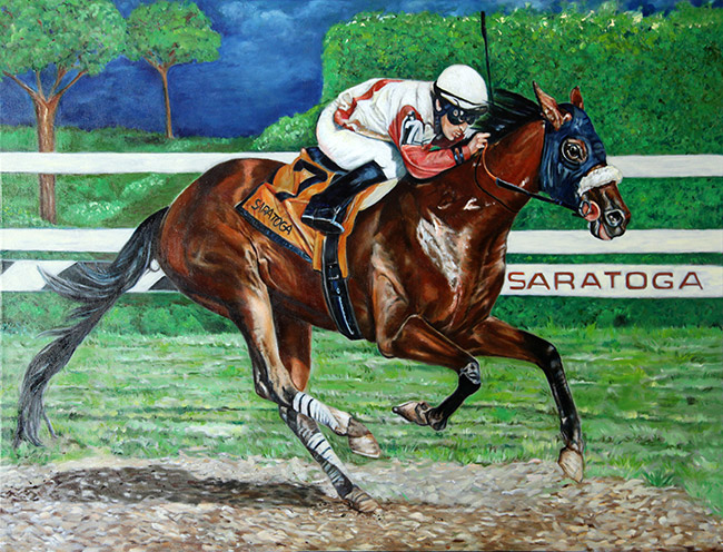
When I paint large scale commissions like this 30x40in oil painting my biggest fear is not only getting all the details right, but shipping it without being damaged on-route to my client. This painting travelled across the country and once I received final confirmation that it arrived save, I breathed a big sigh of relief.
As an artist you spend so many hours on portraits like this and after 16 years of painting custom portraits I still wonder if my client will like the end result of choices that had to be made to get the job done. I am happy to report that my client loves her painting and wants me to do more. I was doing the dance of joy when I heard. You see Wicked Strong's photo was taken on a racetrack as the horse along with it's rider was pulling towards first place. The horse was wickedly fast and had perspired and was kicking up lots of dust as it was racing towards the finishing line. My job as an artist was to convey the strength of this animal and re-create the tense moments of moving towards the finish line.
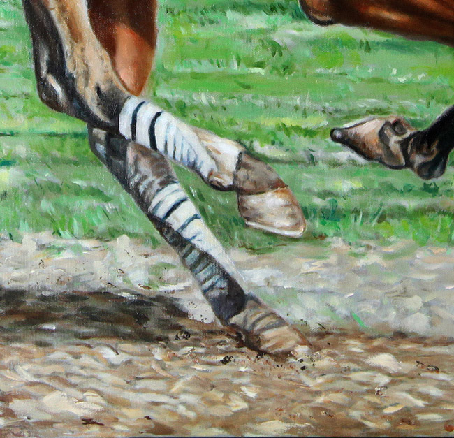
Hoof Detail
One of the ways I added movement was by kicking up dirt where the hooves touched the ground. Specks of impasto paint fly away, but are kept in close value to the colors of the ground so they don't distract. The barrier in the background was actually a series of fences and posts. I opted to keep them as a few horizontal lines which act as a balance and visual separator for the middle ground. There is a slight tilt of the horse moving towards the viewer. The tilt is barely noticeable unless you compare it with the original photo reference, but it is another trick I used to create a sense of movement. If I had kept the horse in-line with the bar in the background the painting would be balanced and even. By moving the horse ever so slightly away and tilting it forward, the animal is moving away from the horizontal bars, thus suggesting a different directional action. The background in the original photo had spectators, hedges and even a fountain. All elements that in this particular painting added nothing of value. The grounds around the Saratoga racetrack have lawn areas and trees so I kept it simple and used those elements along with the large green hedge as anchors. They are intentionally boring, so that your eye wants to keep coming back to the action in the foreground.
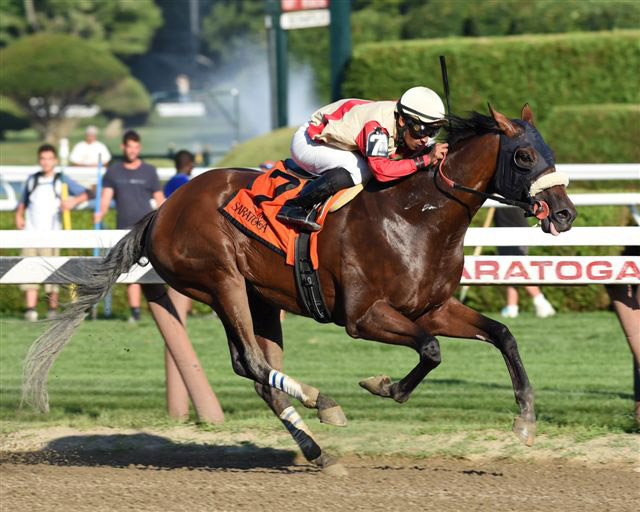
Reference Photo for Painting
My client wanted to have the Saratoga lettering visible as a reminder of where the horse had won. In the painting I moved the lettering over and made it slightly smaller so it would all fit. In the photo everything is a bit muted and I decided to punch it up. Although I am sure my clients love that they jockey steered their horse towards a big win, he is not the star in the horse portrait. Detail work was thus reserved for the head of the horse.
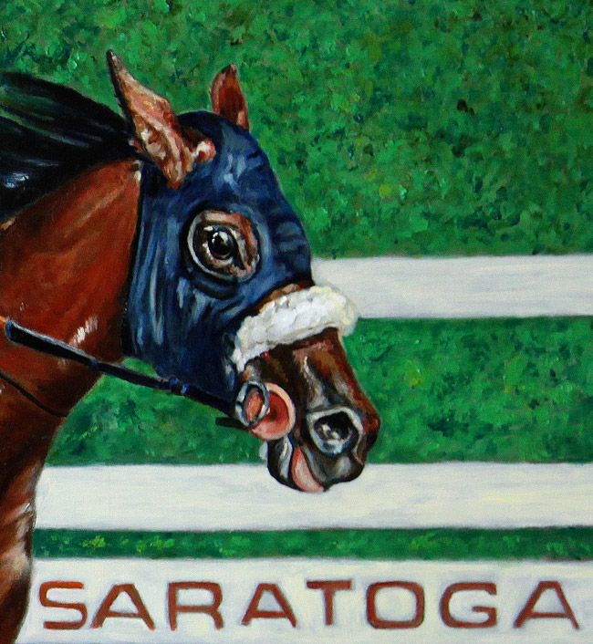
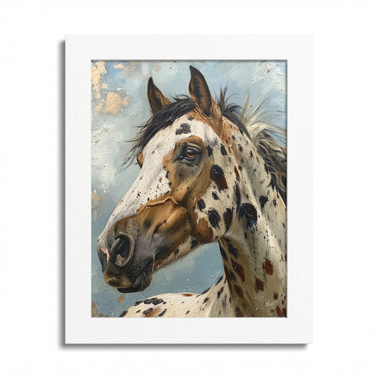
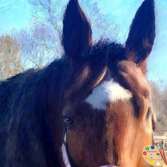
Head Detail
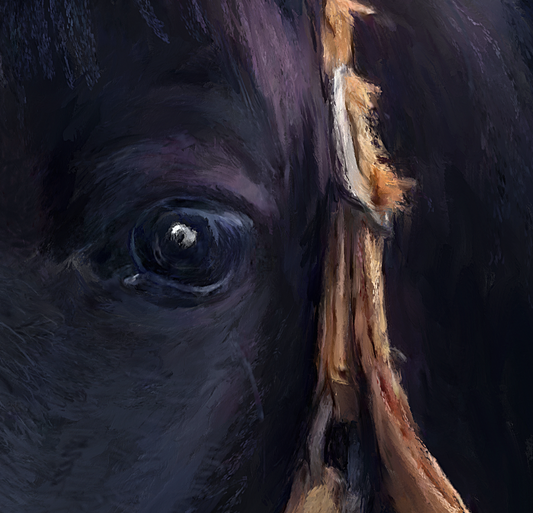
I used a lot of dark blues to bring out the otherwise pretty flat looking head, added more detail to the eyes and built up certain areas with paint. Unlike other head portraits I have done, detail had to be balanced. After all when an animal is moving the eye does not see all the detail, too much detail and it looks fake - too little detail and you can't tell which horse it is. Anyhow, I gave it my best shot and am just thrilled that my client loves her painting. Below is a slide show that shoes the painting in progress. If you like to learn more about ordering your own custom portrait click here.
