Painting Backgrounds

Many portraits do not feature any type of recognizable background, such as an interior or outdoor setting. Instead the subject is placed in front of a dark background that often is rather dull. To make such a backdrop appear atmospheric and interesting, there are a couple of things the artist can do.
1. Positive vs Negative Space
The space on either side of the model is a space that has to be reckoned with. Squint and see how the figure relates to this empty space (background). A figure should not be dwarfed by the background or take up all the space, unless you intent to do so for special design reasons.
2. Laying in the background
With your model in place squint and see what the general value of your background is.
Try to match this color fairly close and block it in. See if your model is casting any shadows and place them as well.
3. Repaint the background every time you start to work on the head or other elements of the painting. I was taught to work from the largest areas towards the smallest and painting backgrounds at the beginning of each session helps to get into tha " painting mode".
A. Watch out for the 'Color book Effect'
A child is taught to color in the face, which is heavily outlined and told not to go over the line into the color of the background. As a painter,when painting backgrounds it's ok to go over the lines! Actually it is necessary to feather the background into hair,side of face, body, etc and vice versa. The background needs to appear airy, a place in which the model is moving rather than having been carved out of.
In coloring books the background color is usually as intense as the color of the objects placed before it, thereby making everything look flat and on one plane.
B. Think of Subtle Opposites
dark vs light colors
cool vs warm colors
broken color vs larger masses
colors in the face, hair and garment vs color of the background
I am saying subtle here because your background should be interesting, but never in competition with the subject. Experiment, it can take a couple of tries! Take the time to step back and see how the background relates to the figure.

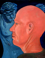
In this example it is not clear what the painting is about. Your eye jumps from the monk to the image of Christ, making it a ping pong effect. I made the background darker on the image on the left in Photoshop to show how sharply contrasting colors create the "cut out" look. The lack of depth is less in the original on the right, because the values of the face and the statue are closer, but the painting does not harmonize. The bald head is not receding at all and is contrasting sharply against the background, preventing the illusion of a convincing background. This painting has so many problems it is unbelievable! This is one of my very early paintings and I am so glad to see that I did make a little progress in my work. There is hope for the most challenged of us! LOL

This is a painting by William Hunt of a monk. If you squint, you will notice how the different colors seem to merge leaving just about only the face to pop out. This is because of all the elements mentioned before that have been masterly applied.
C. Think of Gradations
Gradations are small transition from one color to another, either from dark to light or from a muted color to a more chromatic one.
D. Think of Interaction of Color
Any light casts it's rays on objects vs objects which cast color on that which surrounds them
If you were to use a red light bulb and use it to shine light on your model, you will notice how the face, hair and clothing, as well as the background tend to get a reddish glow. The values will vary in their intensity based on how close they are to the light source, but everything will take on a somewhat reddish glow. This is important because many times you might fuss with the face, feeling something is not correct, whereby the error might be how the colors of the face are relating to their surrounding background.
E. Think of the type of brush strokes you want to apply
If you decide to have visible brush strokes or heavy paint application consider weather or not it is competitive with the face.

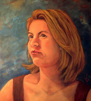
In this example the background has lots of movement, it has the colors of the face and garment integrated in to the background and it harmonizes better than the 1st example. In the original there is a bright burst to the left of the face. This is too much of a value contrast, see how by matching the values to the surrounding area the background reads better? Also notice how the model is better integrated by keeping certain edges softer and values that need to recede closer to each other. Yet, another early attempt...
F. Consider hinting at a loosely handled background rather than a detailed rendition or nothing at all. In 'Anna' (top)the skyline and ocean are kept very subtle thus hinting at the location she is at, without distracting from the figure.
4.In the final stages of the painting introduce some of the colors of the face and garment into the background by either doing a scumble or a wash. These additions harmonize the background with your subject.
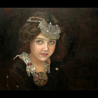 Amal by Enzie Shahmiri
I placed some black around the image of Amal so you can see how I have incorporated some of the face colors in the background. Although the background is very dark, there is still a sense of depth and movement. Amal seems to belong to the space she is occupying. There is a sense of the direction of where the light is coming from through the subtle use of gradation from dark to light. Here I have tried very hard to follow my own advise...
I also like to mention that I believe that there is no 'right way' - only ways to make it better. There are multitude of approaches on color choices, brush treatment and amount of detail chosen for a background. What I find important though is to know when to apply what - to get the desired effect you are after. An educated choice can make a world of difference on how strong your painting reads and I hope that this little tutorial comes in handy.