Many Shades of Grey - The Munsell System

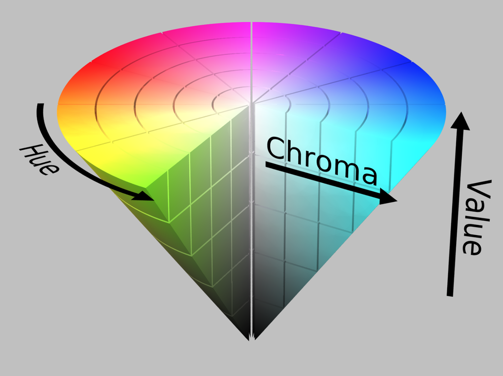
The Munsell system is a way to describe colours, using three different parameters: hue, value and chroma.
Hue- This is the quality which defines colour, based on the colour circle divided in 10 different hues: five principal and five intermediate hues. Each hue is then divided into 10 divisions, in which number 5 is the pure hue and the low and high numbers implying a colour close to the adjacent colour in the colour circle.
Value- The value of a colour describes the lightness or darkness of a given colour: lower values are the darker colours and the higher ones contain more white. The scale ranges from 0 (black) to 10 (white).
Chroma- The intensity of a color.
Chroma - Hue and Value
With a multitude of paint colors at our disposal, it can be quiet a challenge to pick the right color and most importantly the right value to make a painting read as it should. This is were Value Scales such as the Munsell color system comes in very handy.
Value - I use a Masterson Palette Box and place a pre-printed value scale under a 12"x 16" inch glass. Then using Flake White #2 (the most neutral and translucent white) and Micheal Harding's Ivory Black, I mix 9 values of grey and place them in my palette. #10 being white, #9 the lightest gray, getting darker with each value until #0 which will be black. You can use other manufacturers colors, I just like this brand, because it produces warm greys.
When unsure about a value compare it to the values that lie adjacent and ask yourself weather the color you have mixed is lighter than or darker than the color your are looking at. When you think you have mixed the right value, take your palette knife and flatten some of the mix out, then squint and see weather or not it dissapears in the color of your print out. A correct value should barely be distinguishable from your reference print.
Hues- Once all these grays are in place I can mix a value string for any color I might need, provided I match the new color's value through squinting with that of my gray value. Once the desired color has the right value place I place it under the corresponding gray value.
Chroma - When a color is too intense, I add grey of the same value to decrease the intensity.
I have always had a very difficult time distinguishing the value of a color, until my mentor Mr. Marvin Mattelson has introduced me to this system. Now, I no longer second guess myself or spend lots of time mixing up the wrong values. With everything layed out right there on my palette, painting goes faster then ever.
Great Links