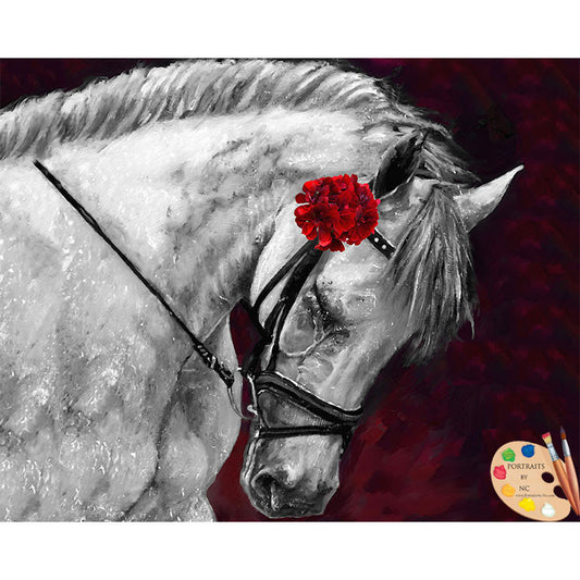
Could color be purer on jewelery?
Could color be purer?
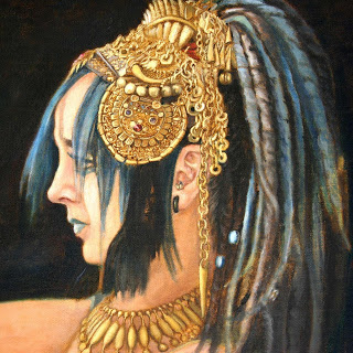
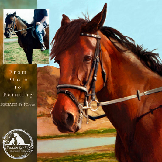
With summer vacation in full swing, it is hard to stay focused and work. Yet, I have been thinking about how to make the headdress better. When working with Yellow Ocher and Raw Umber as the main two colors, it seems the "umph" has to come from the adjacent areas.
There are couple of things that come to mind:
1.Problem:
Colors dull as they are mixed together and they become softer as they are blended, thus making the medallion look boring.
Solutions to consider:
1. Introduce pure, vibrant hues.
2. Reflective material catches the light from it's surroundings, therefore glaze over a tint of the adjacent color.
3.Introduce the "Glow Effect". A colors look brighter if it permeates the atmosphere around it. So for a yellow color to look brighter add that color to the adjacent areas, which would be the background.
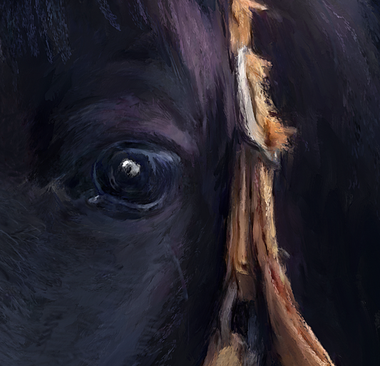
Close-up is here


